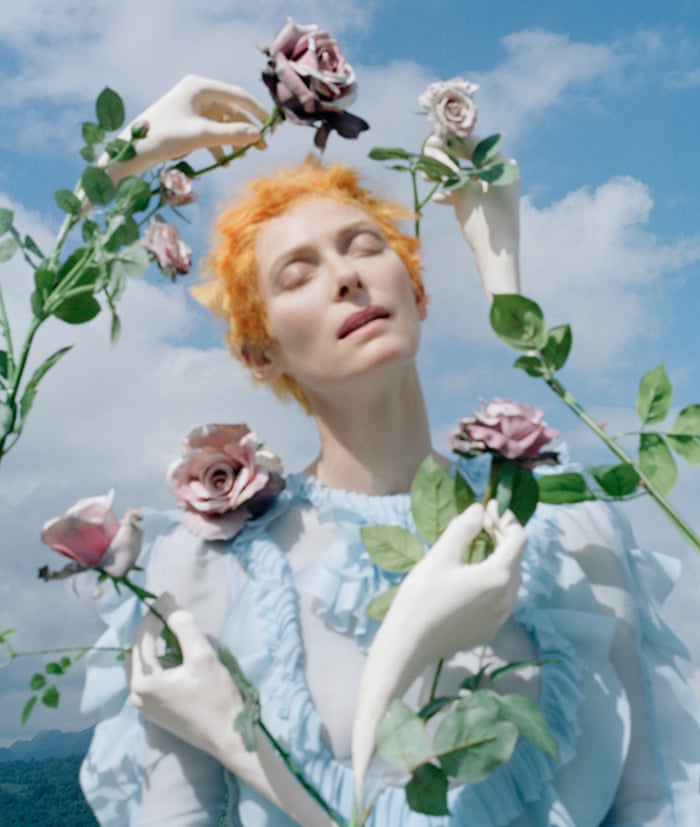
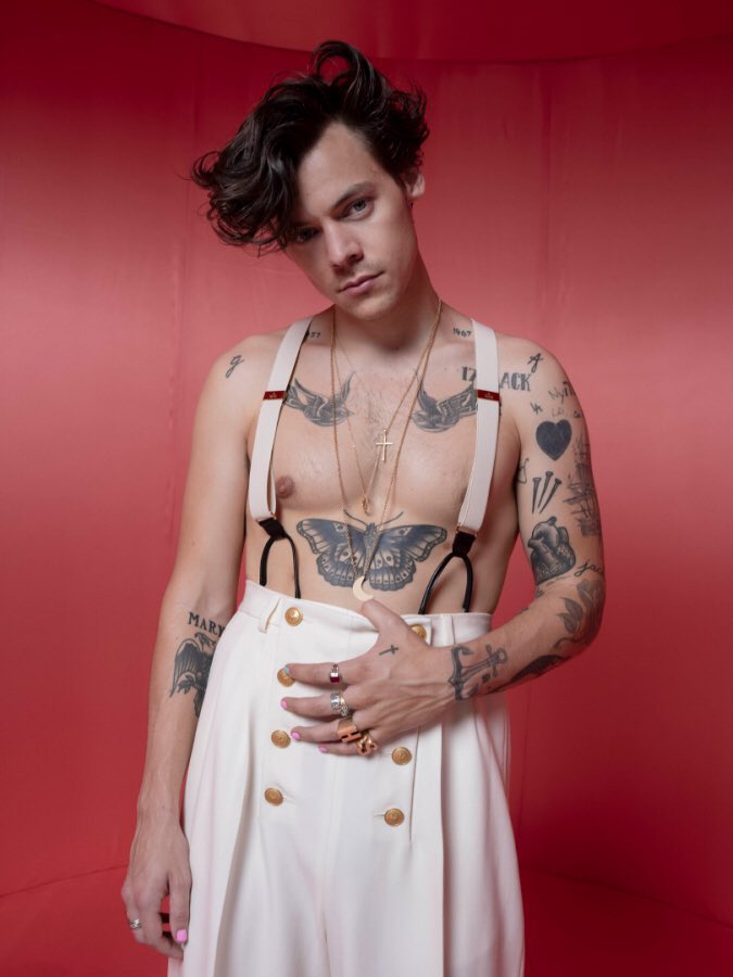
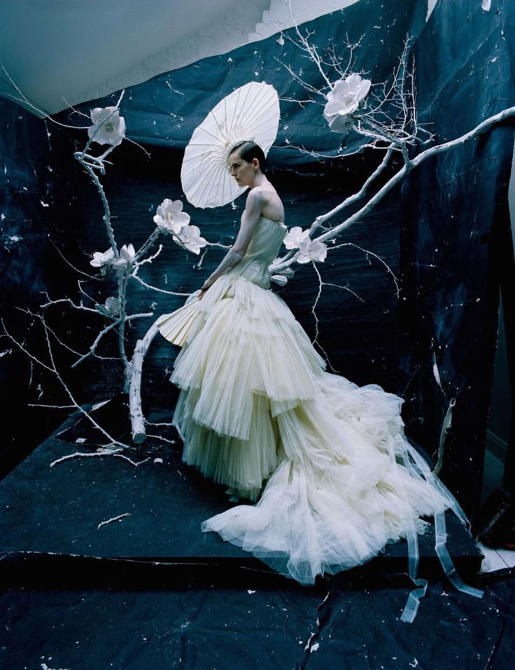
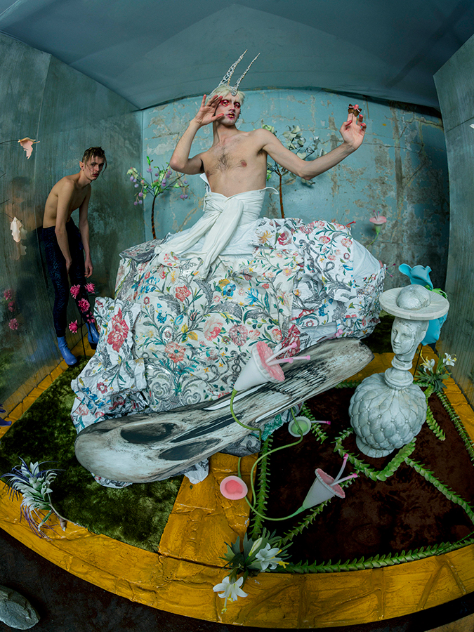
FOR MY BRIEF
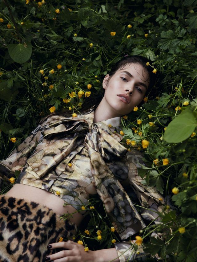
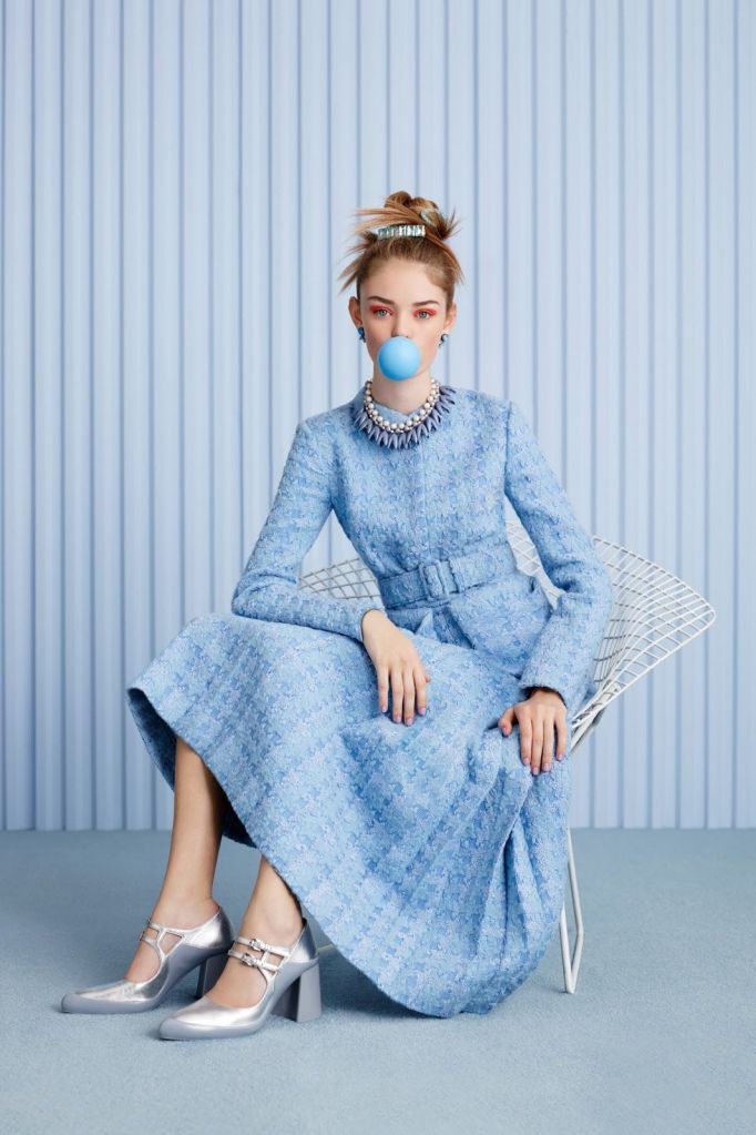
BRIEF-MOODBOARD
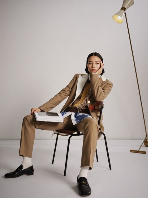
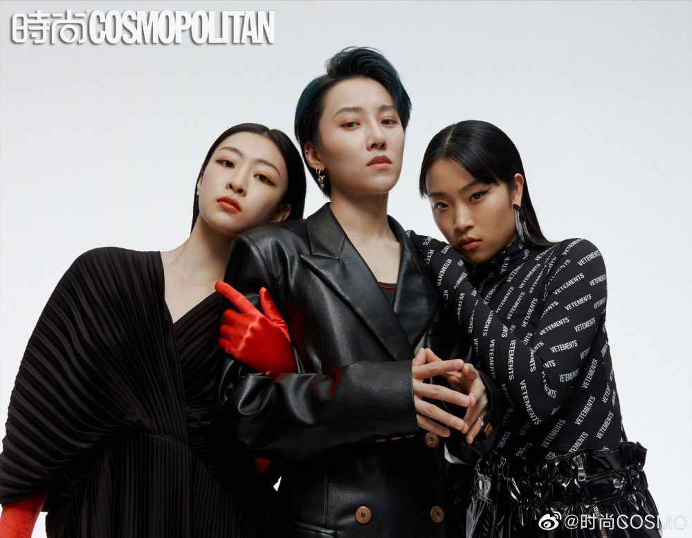
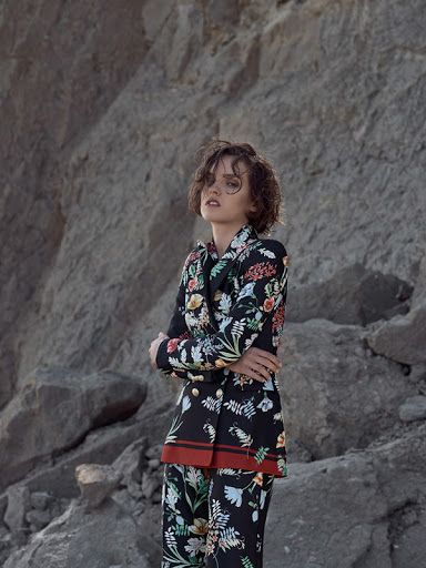
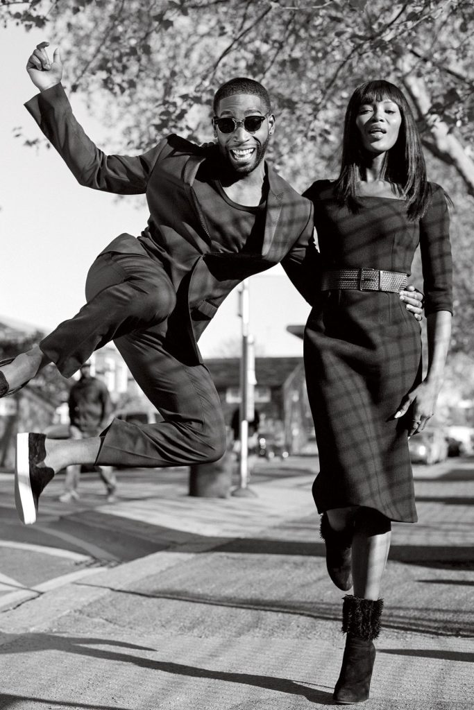
MAGAZINE PHOTOGRAPHS-INSPIRED FOR BRIEF

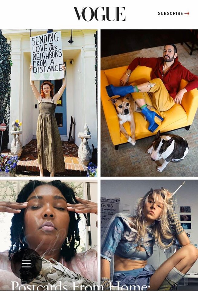
VOGUE MAGAZINE
Vogue Magazine is an American monthly fashion and lifestyle magazine that overs many topics including beauty, fashion, culture,living and runways based in New York City. Vogue began as a weekly Newspaper, first published based in New York in 1892 in the United States before becoming a monthly publication years later.
Vogue also has many other magazine editions all around the world including The British Vogue which was the first international edition which was launched in 1916 , while the Italian version Vogue Italia has been called the top fashion magazine in the world. As of today, there is currently 23 international editions of Vogue.
History
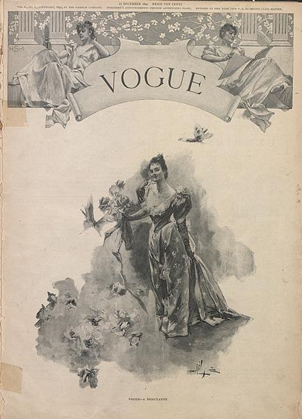
Since Vogues debut in New York City on 1892, Arthur Baldwin Turure who was an American Business man, founded Vogue as a weekly Newspaper based in New York itself. The first issue was published on December 17 of that year and had a cover price of 10 cents. Turner’s intention was to create a publication that celebrated the ‘ceremonial side of life’, the magazine targeted the new New York upper class.The magazine at the time was primarily concerned with fashion, with coverage of sports and social affairs which was included for its male readership.
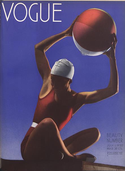
During 1920-1970 Vogue magazine saw an expansion, in 1932 America Vogue placed its first colour photograph on the cover the magazine, Nast was responsible for introducing colour printing and the ‘two page spread’.
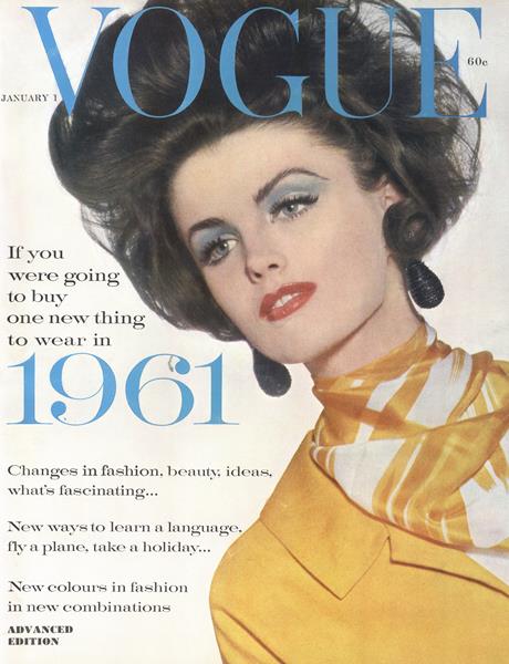
In the 1950s, which is known as the magazines ‘powerful years’, however in the 60s with Diana Vreeland as editor-in-chief, the magazine began to appeal to the youth of the sexual revolution by focusing more on contemporary fashion and editorial features that openly discussed sexuality.
Towards the end of the 60s Vogue extended coverage to include East Village boutiques for example Limbo, they also included features of ‘downtown’ personalities such as Andy Warhol’s ‘Super Star’ Jane Holzer’s favorite Haunts.In 1973 Vogue become a monthly publication, the magazine underwent extensive editorial and stylistic changes to respond to changes in the lifestyle of its target audience.
Overall there has been nine men which have been featured on the cover of American edition of Vogue as of March 2019.
May 2013 marked the first anniversary of healthy body initiative that was signed by the magazine’s international editors. The Australian edition’s June 2013 issue was entitled Vogue Australia “The Body Issue” and featured articles on exercise and nutrition as well as a diverse range of Models. By having a diverse range of models it allows a wider audience range meaning the front cover will appeal to a diverse community.
Style and Influence
Wintour is a British-American journalist and editor who has been editor-in-chief of Vogue since 1988.
Vogue got their name from the word style which is French for Vogue.The publication reaches 11 million readers in the US and 12.5 million internationally, also Wintour was described as one of the most powerful figures in fashion.
In 2009 Wintour launched “Fashion Night”, with the intention of kickstarting the economy following the financial crisis of 2007-2008, by drawing back into the retail environment and donating proceeds to various different charities.
In 2006, Vogue acknowledged salient politaical and cultural issues by featuring the burqa, as well as articles on prominent Muslim women,their approach to fashion and the effect of different cultures on fashion, Vogue appeals to all races and religions making the platform and brand diverse so it appeals to everyone.
Vogue is also inspired and influenced by music as they have had multiple musical artists on their front covers.
Vogue have a history of coverage on historical musical artist, Vogue is a source of contemporary music news on artist such as Jay-Z, Eminem and Taylor Swift.
Online
Vogue also has an online platform. Where they have multiple categories from all their issues ever made going back to 1890s all the way to 2020, The website also consists of top stories that are happening in the Fashion industry, they also have articles on pop culture such as poetry, beauty, arts and lifestyle.They also have topics on recent news.
Vogue also has multiple different websites for country’s around the world.
Vogue also has a weekly podcast that explores the upending forces of fashion, and other interesting subjects.
Vogue Target Audience
- 80% Women, 20% male
- 16-24 years- 35%
- 25-34 years- 34%
- Vogue’s target audience is mainly women and those who prefer to embrace fashion and culture as a lifestyle. The demographic is split into a predominant 80% female and 20% male. 16-34 year olds make up 70% of the demographic with the majority if readers being considered high brow and highly educated with a high and above average income- individuals such as business owners, managers and specialists.
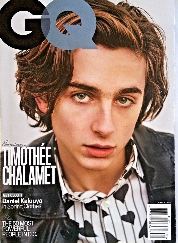
GQ MAGAZINE
GQ Magazine is an international monthly men’s magazine based in New York City and was founded in 1931.
The publication tends to focus on fashion, style and culture for men.However articles such as food,films,sex,music,travel, sports and many others have also been featured in the magazine.
21 editions – 17 country’s have their own version of the magazine, Including UK,KOREA AND INDIA
History
Gentlemen’s Quarterly (GQ) was launched in 1931 in the United States as Apparel Arts.It was a men’s fashion magazine for the clothing trade, and was aimed primarily at wholesale buyers and retail sellers. Initially it had a very limited print run so was aimed solely at industry insiders to enable them to give advice to their customers.
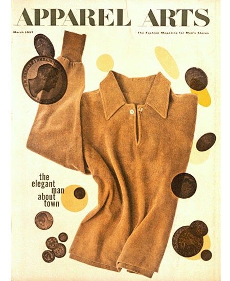
Apparel Arts continued until 1957 when it then it was transformed into a quality magazine for men, this was published for many years by Esquire inc. Apparel was dropped from the logo in 1958 with the spring issue after nine issues and the name we all know today Gentlemen’s Quarterly (GQ) was established.
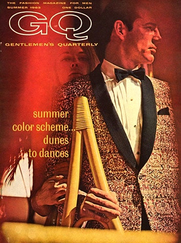
In 1967, Gentlemen’s Quarterly was re-branded as GQ. The rate publication was increased from quarterly to monthly in 1970. In 1979 Conde Nast bought the publication, and editor Art Cooper changed the course of the magazine, introducing articles beyond fashion therefore establishing GQ as a general men’s magazine. In 2003 the magazine became towards the younger audience for those who prefer a more casual style.
GQ has closely been associated with metro-sexuality, meaning their magazine is filled with narcissistic young men sporting fashionable clothes and accessories. Also they persuade other young men to study these models with envy and desire. Therefore the magazine itself has expanded its coverage beyond lifestyles issues for example in 2018 they covered an atricle about Dylan Roof who had show nine African-Americans in a Church In.
MAN OF THE YEAR: GQ(US) first named their Man of the Year in 1996, featuring the award recipients in a special magazine. British GQ launched and annuel Man of the Year awards in 2009.
The magazine reported an average worldwide paid circulation of 934,000 in the first year of 2019, which was 1.1% down from 944,549 in 2016 and 2.6% from 958,926 in 2015. British GQ had an average circulation of 103,087 during the furst half of 2019, which is down by 6.3% from 11,063 during the second half of 2018.
Online
GQ Magazine also have an online platform. On their webesite you can access loads of information about on culture/pop culture such as films and music, grooming, fashion and many more subjects. There’s also a tab at the top of the website where you can change the language/country.
Target Audience
Target audience is male however has attracted the female audience.
Male-63% Female-37%
16-24 years- 34%
25-34 years-39%
COSMOPOLITAN MAGAZINE
Cosmopolitan is an American monthly fashion and entertainment magazine for women; it was formerly titled The Cosmopolitan. Cosmopolitan magazine is one of the best selling magazines and is directed mainly towards a female audience. Jessica Pels is the editor-in-chief of Cosmopolitan magazine.
The magazine was first published based in New York City on 1886 in the United States as a family magazines; it was later transformed into a literary magazine and since 1965 it has become a women’s magazine.
Cosmopolitan magazine is often referred to as “Cosmo“, its content usually includes articles discussing relationships, sex, health, careers, self-improvement, celebrities, fashion, horoscopes and beauty.
Has 64 international editions
History
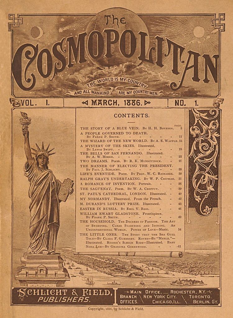
Cosmopolitan originally began as a family magazine, first published in New York City on March 1886 by Schlicht & Fied of New York as The Cosmopolitan. Paul Schlicht told first issue readers that it was a family magazine and that there would be departments devoted to the concerns of women, with articles on fashion, on household decoration and cooking. The Cocmopolitan’s circulation recah over 25,000 that year, yet by November 1888; Sclicht and Field were no longer in business. Johm Brisben Walker acquired the magazine in 1889.
In 1905, William Randolph Heartsr purchased the magazine for 400,000 USD and brought in journalist Charles Edaward Russell, who contributed a series of investigative articles, including ” The Growth of Caste in America”. Hearst formed Cosmopolitan Productions,a film company based in New York from 1918 to 1923, then Hollywood until 1938.The vision for the film company was to make films from stories published in the magazine.
Cosmo was wildly known as a ‘bland’ and boring magazine by critics. Cosmopolitan’s circulation continued to decline for another decade until Helen Gurley Brown became chief editor in 1965. Helen changed the entire trajectory of the magazine for modern single career women, completely transforming the old bland magazine into a racy, contentious and well known successful magazine. As the editor for 32 years, Brown spent this time using the magazine as an outlet to erase the stigma around unmarried women, she was also known as a devoted feminist.
The magazine, and in particular its cover stories, have become increasingly sexually explicit in tone, and covers have models wearing revealing clothes.The UK edition of Cosmopolitan, which began in 1972, was the first Cosmopolitan magazine to branch out to another country.
The magazine currently features topics including sex, relationships, beauty, college, fashion, politics, movies, book, music, money, careers and astrology.
Awards and Features
FUN,FEARLESS MALE OF THE YEAR
For over a decade Cosmopolitan’s February issue has featured this award. In 2011, Russell Brand received the magazine’s Fun,Fearless Male of the Year Award joining Paul Wesley,John Mayer and Jon Bon Jovi.
FUN,FEARLESS FEMALE OF THE YEAR
Nicole Scherzinger received the 2012 Fun.Fearless Female of the Year honor, a titles that had been previously awarded to Mila Kunis, Britney Spears and Shania Twain.
Online

Cosmopolitan also has an online platform, where they have updates on celebrity news , easy outfit ideas, DIY’s and they also have categories on subjects such as Astrology,Lifestyle, Health & Fitness, Politics and many more.
Target Audience
Target Audience consists of women born between 1980-2000
AGE GROUP: 18-34
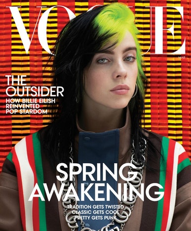
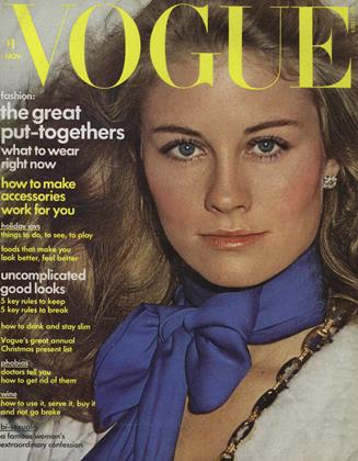
ANALYSE THREE FRONT COVERS
Vogue
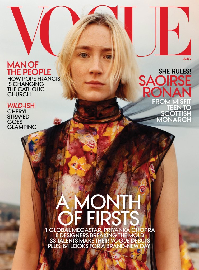
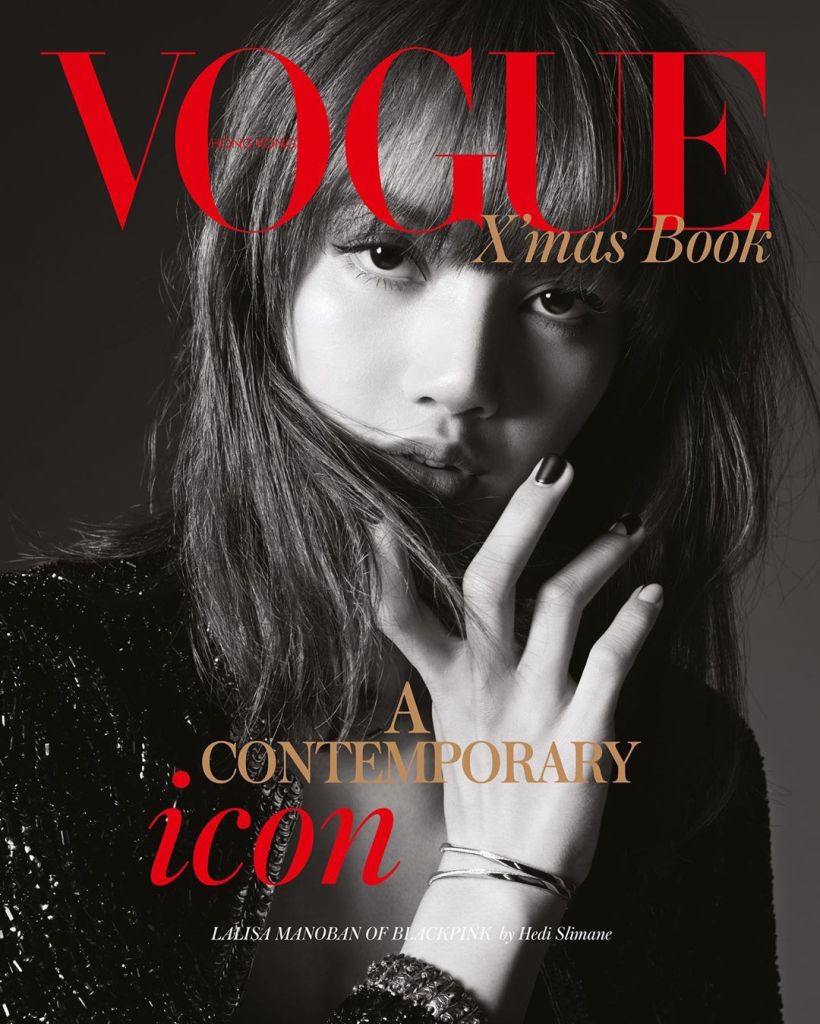
Saoirse Ronan appears of vogues August 2018 cover
The masthead is placed right at the top of the magazine which refers top the name of the magazine, the name of the magazine identifies with what the magazine is about as the title/name is recognisable and the magazine if known for talking about fashion and lifestyles. The masthead is placed behind the model allowing her to be the first thing that draws your attention to the cover. However the masthead is red unlike it usual black or white font; giving the cover a new depth, by having the masthead red it draws attention to the magazine and stands out, it also compliments the rest of the front cover.
The central image is of award winning Irish-American Actress Saoirse Ronan, who is known for her roles in The Lovely Bones, Greta Gerwig’s Lady Bird and Little Women.The central image itself stands out as the model is placed in front of the logo/titles referring that she is the main attraction. The model is shown wearing a floral dress that consists of complementary colours that over bring the whole look and cover together.
The central image could link to David Gauntlett’s theory of identity as the front cover is of a celebrity which could be seen as a role model for the younger audience or the audience in general, the may she her and pix and mix which aspect of her or different subjects they want to incorporate in the construction of their identities. The image of Saoirse Ronan could also link to John Berger’s theory of being glamours , however she is presented with the ‘natural’ look referring to the theme of natural beauty, even though she isn’t shown in a full face of makeup her natural beauty therefore makes hr glamours as she doesn’t need the makeup to make her envied and beautiful.
The cover lines to the left of the magazine are surmised articles of what is inside. for example ‘Man of the people’ is in red letters bringing attention to the writing, these words are followed by ‘how Pope Francis is changing the Catholic Churth’ this sentence shows a range of diversity to the magazine as it shows that they also include articles beyind fashion and lifestyle they include articles on religion, drawing a larger audience in.
We also have the main cover line which is placed at the bottom center, which reads ‘A MONTH OF FIRSTS’ this implies that the magazine will have articles about celebrities first award winnings, this is then followed by the words ’84 for looks for a brand new day’ this sentence brings attention to the magazine and make the readers want to buy it and read on.
GQ
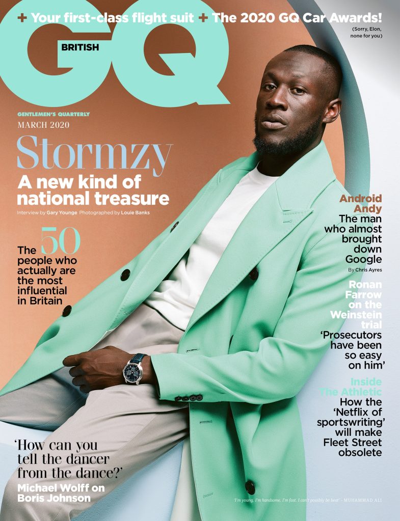
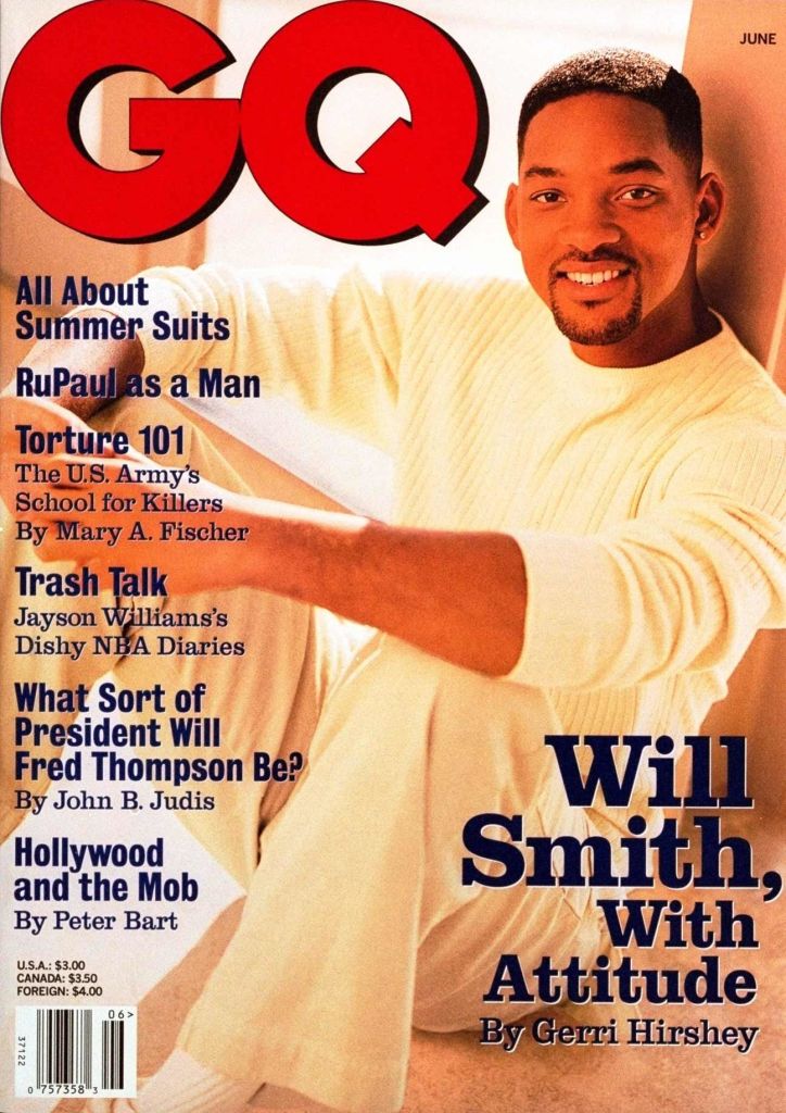
Stormzy on the cover of GQ Magazine March 2020
The title is shown in large letter at the top left of the magazine, drawing attention to the cover.The title is also a mint green colour which is pleasing to the eye, the colour of the title also matches the outfit the model is wearing and the overall theme of pastel colours. Within the title it has the word ‘British’ telling us the magazine is the British edition of GQ magazine.
The central image shows well known British rapper Stomzy. He is shown wearing a mint green trench coat which may give connotations to his wealth as the colour green shows wealth, however the colour mint green shows freshness and youthful which can be seen throughout the front cover. The model is also sitting/leaning on a wall or figue giving the image a new dimension and adding to the relaxed theme of the magazine.
The main cover line reads ‘Stormzy a new kind of national treasure’ suggesting that Stormzy is a public figure who is embracing his nation’s culture and is proud of his British identity.
At the bottom left there is another cover line “‘how can you tell the dancer from the dance’ Michael Wolff on Boris Johnson” this will intrigue readers as it is a summery of an article about Boris Johnson who is Britain’s Prime Minister.
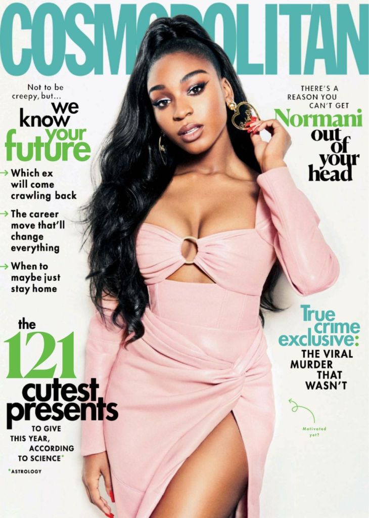
Cosmopolitan
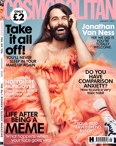
Jonathan Van Ness on the Cover of Cosmopolitan Magazine January 2020
The Masthead is place at the top and spreads right across giving an identity to the magazine, it is in a SANS font making the lettering bold and eye catching. The title is also a light pink colour which goes with the overall theme of the magazine and may have connotations of romance and affection which may be the theme of the cover.
The central image is of Jonathan Van Ness who is an American Hairdresser and is also part of the Netflix series Queer Eye. He is shown wearing a dress therefore showing his is breaking gender roles and stereotypes. This can link to David Gauntlett’s theory of identity as young males may be scared of expressing themselves however seeing a star such as Jonathan Van Ness embracing his femininity and individuality which the audience may relate to and choose which aspects of him they want to use in the construction if their own identity, they may see him as a role model.
The background of the magazine is a pastel blue which is a nice contrast to the rest of the magazine as the colours are mainly pinks and peaches.
One of the cover lines reads ‘Do you have comparison anxiety? how to get curb a toxic habit’, this shows us that the magazine has articles on wider aspects of life and talks about problems you don’t really see in magazines, it also offers advice on how to not have that trait and help.
The main cover line reads ‘Take it all off! you’ll never sleep in you makeup again’ this sentence informs you to make sure to take your makeup off before you sleep, the lettering is bold making it a statement and it standing out to the audience.
500 WORD ANALYSIS
TYLER MITCHELL, STEVEN MEISEL AND ANNIE LEIBOVITZ
TYLER MITCHELL
STEVEN MEISEL
ANNIE LEIBOVITZ
For my 500 word analysis the photographers I will be talking about are Tyler Mitchell, Steven Meisel and Annie Letibovitz.
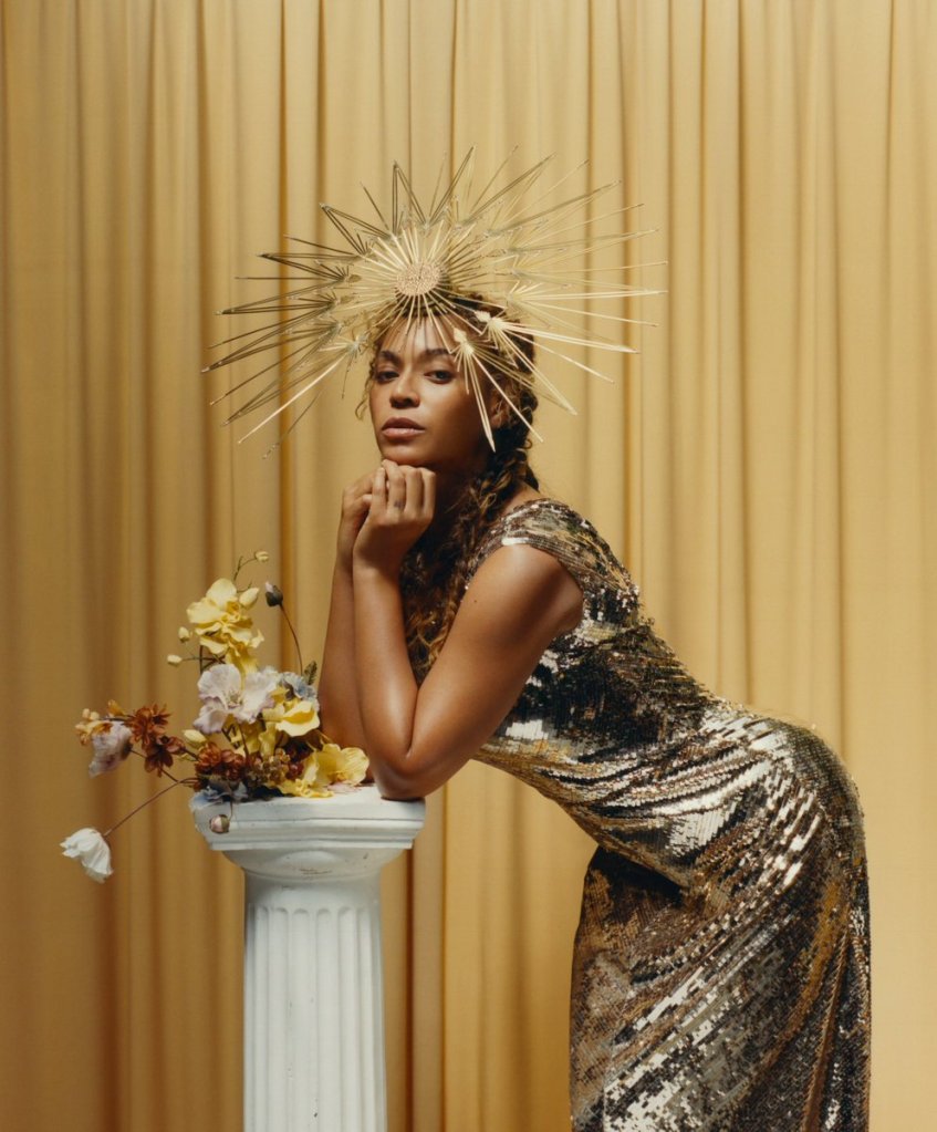
Tyler Mitchell is an American photographer and film maker, in September 2018 Mitchell photographed Beyonce for the cover of American Vogue. The reasoning for why I chose and like Tyler Mitchell’s work is because of the sense of colour that he uses, this could link to Rolard Barthez’s theory of semiotics,he argues that all texts communicated their meanings through a set of signs that need to be decoded by the audience. For example the middle photography of his work shows an array of colours that may have different meanings for the photograph, the model is placed in front of a mainly white background which the colour has connotations of light and cleanliness , this gives the impression that the image may suggests that there is a sense of freedom to the image. The model is also shown wearing the colour red which is also shown in the background, this may suggest power and determination , this could link to references to female empowerment by showing the model in colours that represent power. Tyler Mitchell has also photographed Beyonce who is a high class Star, by him doing this it may causes viewers and the audience may be inspired by the photographs of her which could be linked to David Gauntlett’s theory of identity, he asserts that the media provides us with ‘tools’ that we use in the construction of our own identities.He also talks about how we now offer a more diverse range of stars and icons in the media, this links to Tyler Mitchell’s work because he focuses on photographing diverse communities, therefore this is why i like his work.
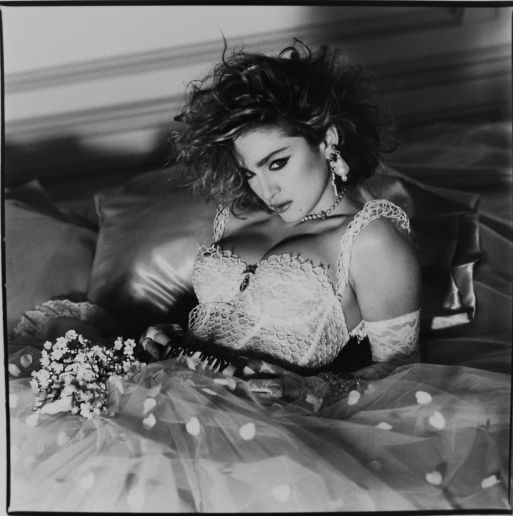
The second photographer’s work I like is Steven Meisel, who is an American fashion photographer who obtained popularity and critical acclaim with his work in US and Italian Vouge. A lot of Steve Meisel’s work is black and white I personally really like this genre/theme of his work as it shows the realism of the photograph, it also shows the rawness and captures the true identity of a person.I also like how the middle and right photograph have a somewhat 60s genre to them, this may suggest that his work is inspired by that genre of time and how he may reflect that on current decades. Steven Meisel also shot the covers for Modonna’s 1984 ablum ‘Like A Virgin’, therefore by doing this is reinforces Gauntlett’s theory of identity at the time the photographs came out Modonna would of been a hug star and role model for girls or males all around the world meaning they would pick aspects of her identity and take is as their own.
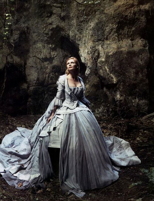
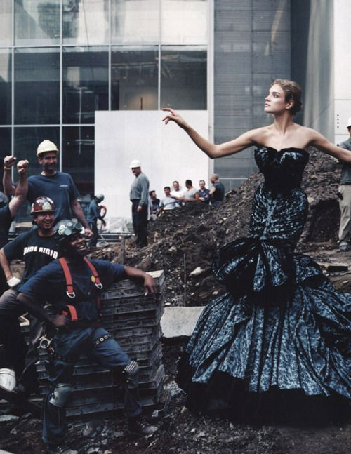
Finally, the third photographer I have chosen is Annie Letibovitz. Anna Letibovitz is a American Fashion photographer, she worked for the Rolling Stone Magazine. I personally like her work because I feel there is a meaningful story behind each photograph, she has a somewhat fantasy feel to her photographs that I like. I think how her work is out of the ordinary and different from other people, Annie Letibovitz’s work could possibly link to Levi -Strauss theory of Binary Opposites as she places models who are in beautiful dresses and have their makeup done in places they wouldn’t usually be for example the third example of her work the model is seen posing on a construction site.
HEARST AND BAUER PUBLICATION RESEARCH
Bauer
Bauer Media Group is a German multimedia conglomerate headquartered in Hamburg that manages a portfolio of more than 600 magazines, over 400 digital products and 50 radio and TV stations around the world.
Bauer Media Group have approximately 11,000 employees in 17 countries.
Founded in 1875, Yvonne Bauer is the CEO of the Company.
Bauer reaches over 22 million UK adults, with all the publications in sales in both digital and print.
Bauer Media’s network of 107 brands target disparate audiences from under 18s to over 65s which means we are uniquely placed to provide engaging and perceptive insight on all UK audiences.
BAUER UK– Bauer Verlagsgruppe has been managed by five generations of Bauer Family. Originally a small printing house in Germany. Beauer Media Group entered the UK with the name H Bauer Publishing they became Britain’s third largest publisher.
H BAUER PUBLISHING BRANDS– Titles include women’s weekly and TV listings magazines, namely Bella, Take a Break, that’s life! TVChoice and Total TVGuide along with a number of puzzle magazines.
Bauer Media is a multi-platform media group, with locations across the UK. The Bauer media group acquired a collection of media brands; This includes heat and Grazia as well as a radio portfolio of national radio brands such as KISS FM UK and Magic.Bauer Media also have music publications; Q started out as a music magazine published monthly in the United Kingdom.
They also have other publications for example The Debrief is an online magazine aimed at ABC1 women in their 20s launched in 2014 in competition with Mail Online and Stylist.Empire is a monthly film magazine, originally launched in the UK in 1989, but is now published in the US,Australia,Turkey,Russia and Portugal.It organises the annual Empire Awards, currently sponsored by Jameson. The awards are voted for by the readers of Empire.
Hearst
Hearst is a leading global diversified media, information and servuces company with more than 360 businesses.
Hearst Magazines is one of the world’s largest publishers of magazine media across all platforms with more than 300 editions and 240 websites around the world.Some of the brands are Cosmopolitan, Elle, Esquire and Bazaar.
Hearst is for a range of both men and women and collects information on its audience and demographics to see what gender are buying more of what magazine. For example the Cosmopolitan ratio for men buying the magazine is 30% and for women buying the magazine it is 70%.
Hearst owns newspapers, magazines, television channels, and television stations, including the San Francisco Chronicle, the Houston Chronicle, Cosmopolitan and Esquire.
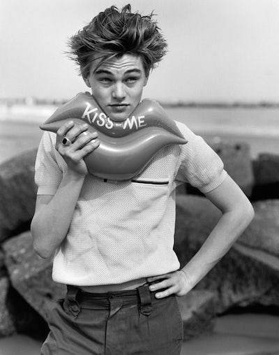
FAVOURITE IMAGES


These 3 images are some of my favourite photographs I have found while doing my research.
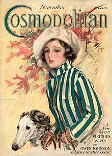
The reason I like these photographs is because of the simplicity of them all, they come across simple as they each have a plane background and consist of one picture.However they all have their own individuality that I like.For example the first one really stands out to me as it is the only black and white cover, I personally think this add to the realness of the image and gives it a new vibe or styles.I also like the first image as it portrays the idea of being glamours and classy which really brings attention to the image. This photograph can link to Roland Barthez’s theory of semiotics which is the study of sign processes; he argues that all texts communicate their meanings through a set of signs that need to be decoded by the audience.The image is in black and white which comprises only highlights, shadows, and the shades of grey in between; the editor/photographer may have used black and white film or an effect to exaggerate the photograph giving it more depth and possibly giving the audience a wider connection to the image as some people believe that black and white images show the true identity of a person. The black and white theme of the photograph can also link to Levi-Strauss’s theory of Binary Opposites.He suggested that the way these binary oppositions are resolved have ideological significance and as such communicates meanings to the audience. Black and White are on the opposite sides therefore making them binary opposites,white has connotations to light giving the image a bright view point, however black has connotations of power, and sophistication which could possibly show a sense of empowerment and possibly making the readers have a different perspective of the cover/magazine.
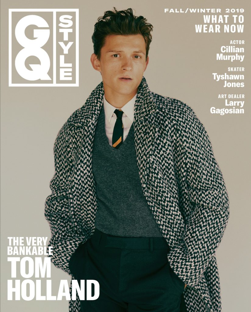
The reason I like the GQ image is because of the layout of the fonts, the celebrity’s name is shown in the bottom left corning which makes the image the main focus, the font is a strong choice of sizing which really bring the image together. The image shows direct address meaning it is for the audience and is trying to grab the attention.The image can link to Barthez’s theory as the photograph and model are seen in pastel colours which adds a soothing nature to the overall view point.The use of the pastel colours also has a strong affiliation with spring and summer which are the opposite seasons that this cover was issued for as it was resealed for ‘Fall/Winter’, the reasoning for this may be due to fact fall/winter colours are dark and possibly dull so therefore by presenting bright and refreshing pastel colours it draws the audience in. I also like this photograph as it has a modernised 60s feel to it.
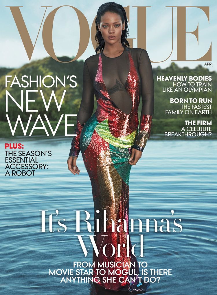
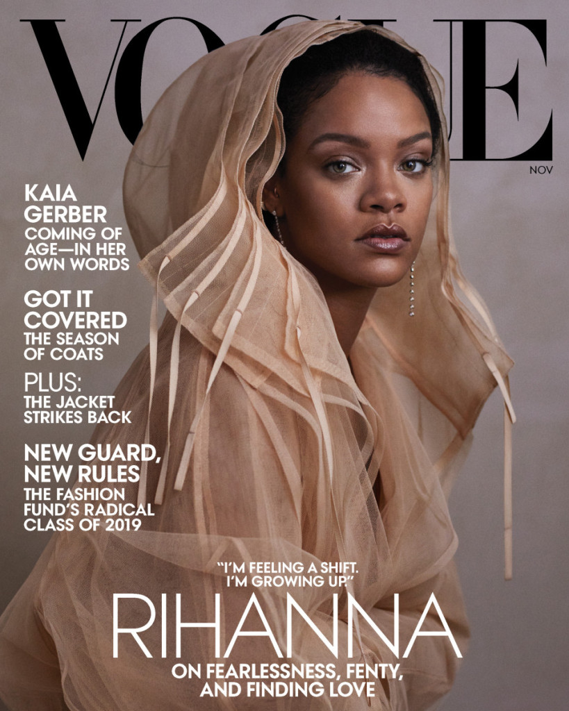
Finally, I like the last photograph due to the colours that have been used I think the beige brown tone is really fitting with Rhianna’s complexion, I also like they way she in angled in the photograph it give the image a new dimension and a new perspective she has a direct approach which draws the readers in. I also like how the title of the magazine is in contrast to the rest of the cover as it is in black and the rest is natural bright colours, the use of the black lettering shows power and sophistication which makes the image really stand out, the lettering is also placed behind the model telling us that Rhianna is the main focus.The white lettering gives the image/cover a refreshed look and brightens the overall cover.
FASHION IMAGES
BRUCE WEBER
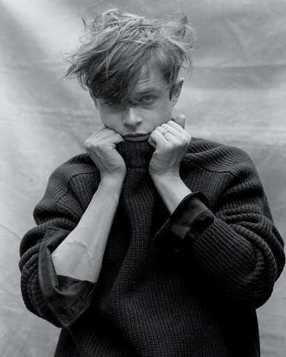
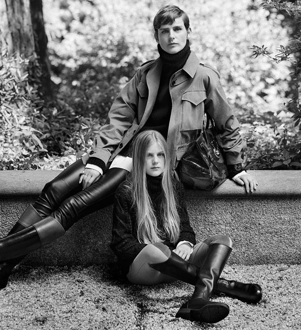
Bruce Weber is an American fashion photographer and occasional film maker.He is most wildly known for his ad campaigns for CalvinKlein, Ralph Lauren, Gianni Versace, as well as his work for Vogue,GQ, Rolling Stone magazine and many more.
His fashion photography first appeared in the late 1970s GQ magazine, where he had frequent cover photos. He came to the attention of the general public in the late 80s and early 1990s with his advertising images for Calvin Klein, and his portrait of the young actor Richard Gere. Some of Weber’s other earliest fashion photography appeared in the SoHo Weekly News and featured a of men wearing only their underwear.
Weber’s photographs are occasionally in colour; however, most are in black and white or toned shades. They are gathered in limited edition books.
Weber’s photographs are occasionally in colour;however, most are in black and white which is the main reason his work intrigues me.His work is outstanding in colour and black and white telling us he is a man of many talents and knows how to take a good picture no matter the circumstances or technique.
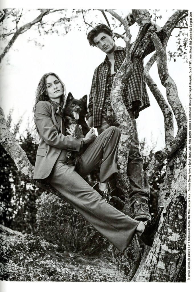
This photograph has many elements that I like for example, I like how Weber has incorporated nature into this image as the models are shown posing/ resting on a tree;the reasoning for this may be to show a fresh and cleansing look.I also like the tones that are shown through the photographs, the mixture of different shades a grey and the black and white really complement each other.The models are also both looking at the camera telling us this is direct address meaning the audience is the main target and are being directly spoken to.Weber has also used different props for example the setting is outside and the models are also posing with a dog making the image have a new meaning which could possibly be enjoyment and love which can be shown through the dogs facial expression it also applies to these emotions as the female model as a light smirk on her face which could love to her feeling joy.
TIM WALKER
Timothy Walker is a British fashion photographer, who regularly works for Vogue,W and Love magazine.
Walker’s interest in photography began at the Condre Nast library in London where he worked on the Cecil Beaton archive for a year before university.After a three year BA Honors degree in photography at Exeter College of Art, Walker was awarded third prize as The Independent Young Photographer Of The Year.
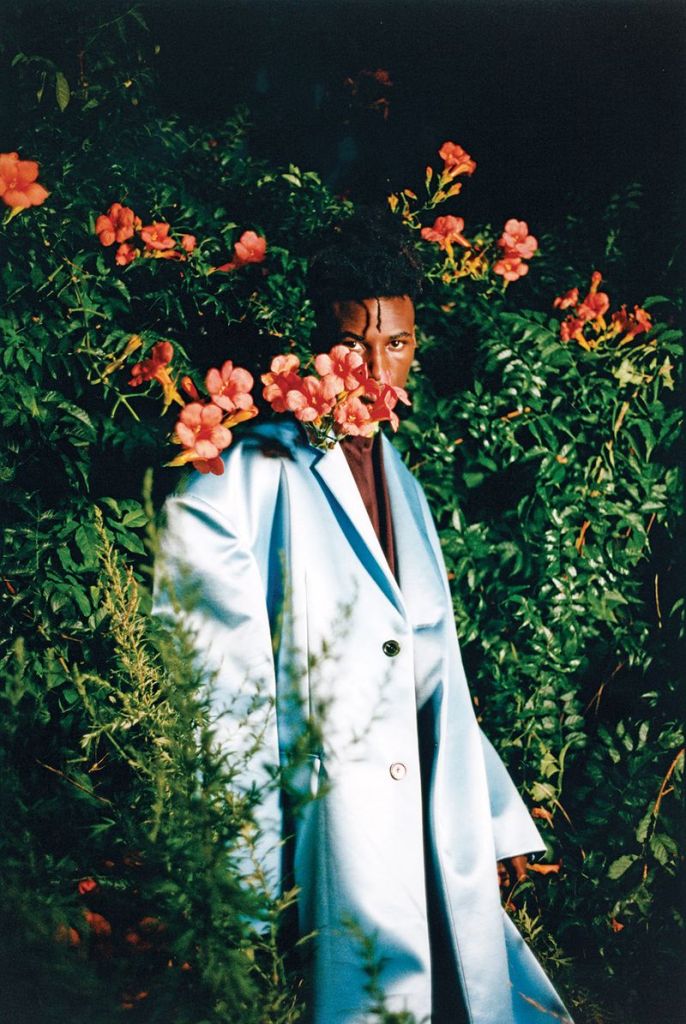
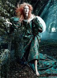
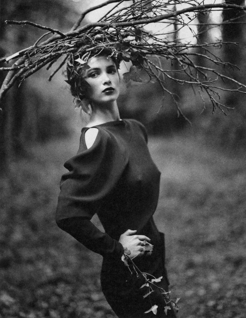
Tim Walker’s work is out of the ordinary and could been seen as Binary Opposites to regular fashion photographers meaning he likes to take risks with his work and do the unexpected. I like his work due to the unique style he has, this image incorporates many different vibrant colours that overall bring the image together. The colours that are used may add to the meaning of the photograph; for example the use of the colours yellow and green may suggest energy, happiness and positivity and freshness and harmony which could be used to show the emotions that people will experience while looking at this photograph.
I also like his work as he breaks boundaries which could link to Van Zoonen’s theory of gender stereotypes, he suggests that the meaning of gender varies according to cultural and historical context.However Tim Walker subverts this theory as his male models aren’t seen in the stereotypical ‘male’ clothing , but some of them are seen wearing skirts, dresses which some people would assume to be more feminine. He breaks boundaries and experiments with clothing and models, he tries to break the stereotype of ‘men should be men’ or the idea that men shouldn’t have a feminine side which isn’t the case he expresses the true nature of people and doesn’t care about what others think because his work tells stories and breaks the rule which I love. This photograph could possibly link to David Gauntlett’s theory of identity as he asserts that the media provides us with the ‘tools’ or resources that we use to construct our identities, he suggests we ‘pix and mix’ which aspects of the product we want to use to construct our own identities.This is relevant to the photograph as there is male model is wearing a skirt, has makeup on and is surrounded by floral patterns; the audience or young males may see this image and be inspired as it shows empowerment by allowing you to be who you are, therefore someone could use this image to help them create their own identity or be who they want.
TARGET AUDIENCE RESEARCH
18-34 AUDIENCE
For several decades, the 18-34 age group has been considered especially valuable to advertising/advertisers. It is the biggest cohort, overtaking the ‘baby boomers’ in 2015, and 18 to 34s are thought to have money to burn on clothes and products, rather than the more staid investments of middle age.
Comscore Network,found that 72% of all 18-34 years olds are online/social media.
18 to 34 year olds account for a significantly larger share of internet usage.
18-34 year olds feel a perpetual need to stay connected therefore they tend to get their news/information online.
ACORN USER GUIDE FOR TARGET AUDIENCES
Acorn user guide is a powerful consumer classification that segments the UK population. It does this by analysing demographic data, social factors and consumer behavior. Acorn provides a detailed understanding of different people and also helps you learn about their relationship with you and your organisation. Therefore this knowledge gives consumers an understanding to help companies target, acquire and develop profitable customer relationships and improve service delivery.
Acorn works by analysisng significant factors and social status. It segments households, postcodes and neighbourhoods into 6 categories, 18 groups and 62 types. By analysing significant social factors and population behaviour, it provides cprecise information and in-depth understanding of the different types of people.
There are 6 types of people and these are:
Affluent Achievers
Affluent achievers are some of the most financially successful people in the UK. They tend to live in wealthy, high status rural,semi-rural and suburban areas of the country; they are usually middle aged or older people who are nesters and wealthy retired. However some neighbourhoods contain large numbers of well-off families with school age children, these neighnourhoods occur in the more suburban locations. These people live in large houses, which are usually detached with four or more bedrooms. Some will own homes worth millions. A high portion of these people are very well educated and employed in managerial and professional occupations. Many own their own business; and incomes are generally well above the average.
Many can afford to spend freely and frequently and have also built up savings and investments.
Wealth has also been or is currently being built up through their expensive houses.Most of these people are owner occupations with half owning their homes and the remainder often have significant equity in their homes. They are also usually confident with new technology and managing their finances; these people are established at the top of the social hierarchy.
These people often read the financial pages to keep up with economic affairs in general and their investments. They are often financial sophisticated, purchasing a wide range of financial products , or have a advisor to do it for them. They are likely to have premium bank accounts, the variety and level of online shopping is generally well above most other types.
Rising Prosperity
These people are generally younger, well educated, and mostly prosperous people living in major towns and cities.Most are singles or couples, maybe some are yet to start a family, but others have younger children. They are often highly educated younger professionals moving up the career ladder. Most live in converted or modern flats, with a significant proportion of these being recently built.While many have good income not all might yet have had time to convert these substantial saving or investments.They are more likely to financially confident, managing their money and choosing the provider of their financial, or other services.
They are the internet generation ‘early adapters’ most likely to use smart phones and frequently use the internet and new technology.
Single people and couples without children form the majority of people in these areas. Many are graduates and white collar occupations tend to predominate, including senior managerial and professional jobs. While not all of them are highly paid, incomes are above the national average and a good number pay higher rates of tax.
Many of these people are financially aware, reading the financial pages, switching accounts, carrying out financial transactions online and with multiple cards.
Comfortable Communities
Contain much of middle-of-the-road Britain, whether in the suburbs,smaller towns or the countryside.
All lifestyles are represented here.Many areas have mostly stable families and empty nesters, especially in suburban or semi-rural locations. There are also off pensioners, living in retirement areas around the coast. Generally people own their own homes.Most houses are semi-detached or detached, overall average value for the region. Incomes over all are average, some will earn more, the younger people a bit less than average.Those better established might have built up a degree of savings or investment. Employment is a mix of professional and managerial, clerical and skilled occupations.Educational qualifications tend to be in line with the national average.
Most people are comfortably off. They may not be very wealthy, but they have a few major financial worries.
These are areas of the lowest population densities in the country, raging from remote farming areas to smaller villages and housing on the outskirts of smaller towns. Housing is typically owner occupied, detached or semi-detached however there will be some renting and tied property. While there is a fair amount of agricultural employment there are also many other skilled occupations and some areas with much lower turnover of home ownership than usual.
They are moderately frequent users with the internet, although some might prefer active lifesyle.
Financially Stretched
This Category contains a mix of traditional areas of Britain. Housing is often terraced or semi-detached, a mix of lower value occupied housing and homes rented from council housing associations, including social housing developments specially for the elderly. Also includes student term-time areas.There tends to be more single parents, separated and divorced people than average. Incomes tend to be well below average. Although some have reasonably well paid jobs more are in low paid administrative, clerical,semi-skilled and manual jobs. Apprenticeships and A levels are more likely educational qualifications. Unemployment is above the average- claiming benefits.
People are less likely to engage with financial services.Fewer people are likely to have a credit card; some are likely to have been refused credit and will be having difficulties with debt.
They will find time for going out as well as going on online. Their interests may focus around social and leisure activities. In addition to the broadsheet newspapers, film, computing, education and style magazines may be their preferred reading.
The majority will not earn enough to pay tax.
Urban Adversity
Contains the most deprived areas of large and small towns and cities across the UK.
Household incomes are low, nearly always below the national average. The level of people having difficulties with dept or having been refused credit approached double the national average. The numbers claiming Jobseeker’s Allowance and other benefits is well above the national average. Levels of qualifications are low and those in work are likely to be employed in semi-skilled or unskilled occupations. The housing is a mix of low rise estates, with terraced housing and semi-detached houses, and purpose built flats, including high rise blocks. Properties tend to be small and there may be overcrowding.
Over half of the housing is rented from the local council or a housing association.
There is a large number of single adult households, including many single pensioners, lone partners, separated and divorced people. There are higher levels of health problems in some areas.
These are people who are finding life the hardest and experiencing the most difficult social and financial conditions. These people have a modest lifestyle and some may be struggling to get by in the current economic climate.
Not Private Households
Where the bulk order of residents are not living in private housing.
TYPE 60: ACTIVE COMMUNAL POPULATION
These people may be in communal establishments yet still consumers to some degree. This includes defence establishments, for example people living in military base.
It also includes hostels and other holiday accommodation. Generally this is accommodation that may be unoccupied for part of the year, or where the people living in the accommodation regularly change. Other active communal accommodation may include hotels, children’s homes, refugees.
TYPE 61: INACTIVE COMMUNAL POPULATION
These people may be in communal establishments but unlikely to be active consumers. This includes care homes, hospitals and other medical or nursing establishments where due to their health the residents are unlikely to go out and about to function.
TYPE 62: BUSINESS ADDRESSES WITHOUT RESIDENT POPULATION
These are postcodes where there is no regular residents.An example would be a business or industrial park.
FASHION IMAGES
SEMIOTIC ANALYSIS OF A DOUBLE PAGE SPREAD
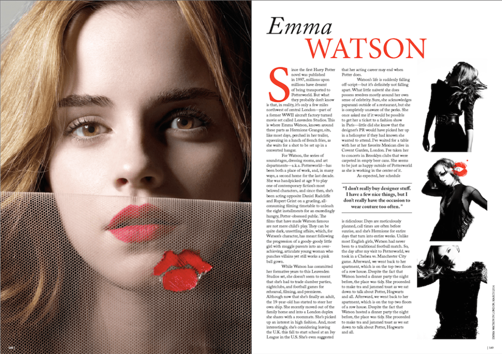
The picture above is a double page spread from Vogue, which features the English Actress, model and activist Emma Watson who is best known for her role as Hermione Granger in the Harry Potter series.
How Can Semiotics be applied to a Double Page Spread?
Semiotics is the study of sign processes which is a theory proposed by Roland Barthez. He argues that all media texts communicate meanings through a set of signs that need to be processed through denotation (what is specifically in the text) and connotation ( what the text implies) which can also be known as structuralism.
Firstly, If we look at the central image of the double page spread, it clearly shows social attitudes to the way women are perceived in the media and beauty standers. Emma Watson brings star appeal and possibly sexuality which is shown above. The central image it’s self is direct address making the image powerful , as the image of her is a close up of her face. The camera tends to focus more on her eyes are her lips which draws the audience in; by focusing on the lips and eyes it suggests themes of sexuality and passion and could possibly appeal to the male audience.Further looking into the central image we take notice of the models appearance, she is seen wearing a bold red lip automatically drawing attention to the image and especially the lips in general. Red Lips suggests confidences and self-assurance which certainly applies to the model herself. The model has been airbrushed to eradicate imperfections drawing attention to the lips, also suggesting that the beauty standers today should consists of flawless and smooth skin further implying the theme of natural beauty, her hair has blown out and is perfectly placed around her face giving her nice structure and appearing as glamours but also natural reinforcing natural beauty. Her facial expression seems calm yet serious and portrays a senses of seduction. Here, this can link to Laura Mulvey’s theory of the male gaze; which is when men look at women with lust and women look at these women being looked at. This can be applied to the double page spread as the three smaller photographs in the fare right different codes of gesture and expression which could suggest seduction,the model is also wearing red lipstick further adding to the theme of seduction as this is shown on the double page spread it could lead to a male viewpoint or a larger audience appeal as the male or female audience may see this double page and want to but it because she’s beautiful or to be like her. The images in the far right are black and white which comprises only highlights, shadows, and the shades of grey in between; the editor/photographer may have used black and white film or an effect to exaggerate the photograph giving it more depth and possibly giving the audience a wider connection to the image as some people believe that black and white images show the true identity of a person, therefore the audience have a more personal connection to Emma Watson through the three images. The black and white theme of the photograph can also link to Levi-Strauss’s theory of Binary Opposites.He suggested that the way these binary oppositions are resolved have ideological significance and as such communicates meanings to the audience. Black and White are on the opposite sides of the spectrum therefore making them binary opposites; white has connotations to light and cleanliness giving the image a bright view point, however black has connotations of power,elegance and sophistication which could possibly show a sense of empowerment and empowering the viewers of this magazine.
The text states ” Watson’s life is suddenly falling off- script but it’s definitely not falling apart”, this quote reinforces the appeal of Emma Watson as she can take charge and control her life and still be successful, it could also suggest a face paced lifestyle but still having everything together.
The double page spread further links to Laura Mulvey’s theory of the male gaze, as Vogue magazines usually consist of models,musicians and actresses. These type of people could be consider a male ideal type or some they aspire to be with, also these are be who women aspire to be. Therefore by Emma Watson being in the magazine she probably inspires a lot of women making them be interested in the magazine and buy it. David Gauntlett’s theory of identity is relevant to the double page spread as her asserts that the media provides us with the ‘tools’ or resources that we use to construct our own identities, we can the uses these tools to ‘pix and mix’ which aspects of the product we want to use in constructing our identities. This applies to the editorial as the model above is the actress Emma Watson, who is a well respected activist;however she has portrayed different aspects through this double page spread as she is shown through her playful yet seductive , black and white photo-shoot.However by her being featured in the articles and magazine it brings in the target audience or other audiences as she can be seen as a huge role model for women all around the world, this can also link to the quote ” I don’t really buy designer stuff. I have a few nice things, but I don’t really have the occasions to wear couture too often”, through the calming discourse Emma presents herself as humble and tells the audience that you don’t need designer things to feel successful or to be successful and that you should stay true to yourself.
The double page spread also tend to focus on the three colours (apart from the central image) which are red,black and white. This gives the magazine a chic and sophisticated style. The black and red have connotations of passion,love and sophistication reinforcing the themes that are portrayed through the images; the colour red is bold and automatically draws attention, which could suggest the type of target audience that they are bold and independent women. The black and which add a chic and classic vibe to the magazine, much like Vogue itself; the magazine is know for its outstanding and classic front pages and articles.
The text that is used is a serif font making the text easy to read, the serif font also gives the text a sense of traditionalism or classic style appeal.
The discourse of the text is easily understandable and well put together.It has a some what friendly feel about it echoing the magazine itself as the magazine is for everyone and mostly females, so the discourse portrays a sense of awareness and how it feels like you are the person experiencing the interaction with Emma. The discourse is also quite interesting as it goes into depth about certain situations in Emma’s life and how the fact she’s a famous actress she is also an ordinary person.
