FAVOURITE IMAGES
These 3 images are some of my favourite photographs I have found while doing my research.
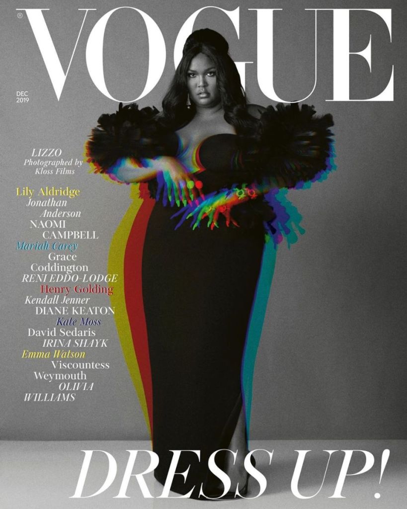
The reason I like these photographs is because of the simplicity of them all, they come across simple as they each have a plane background and consist of one picture.However they all have their own individuality that I like.For example the first one really stands out to me as it is the only black and white cover, I personally think this add to the realness of the image and gives it a new vibe or styles.I also like the first image as it portrays the idea of being glamours and classy which really brings attention to the image. This photograph can link to Roland Barthez’s theory of semiotics which is the study of sign processes; he argues that all texts communicate their meanings through a set of signs that need to be decoded by the audience.The image is in black and white which comprises only highlights, shadows, and the shades of grey in between; the editor/photographer may have used black and white film or an effect to exaggerate the photograph giving it more depth and possibly giving the audience a wider connection to the image as some people believe that black and white images show the true identity of a person. The black and white theme of the photograph can also link to Levi-Strauss’s theory of Binary Opposites.He suggested that the way these binary oppositions are resolved have ideological significance and as such communicates meanings to the audience. Black and White are on the opposite sides of the spectrum therefore making them binary opposites; white has connotations to light and cleanliness giving the image a bright view point, however black has connotations of power,elegance and sophistication which could possibly show a sense of empowerment and empowering the viewers of this magazine.
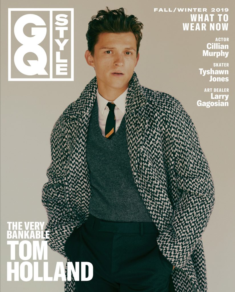
The reason I like the GQ image is because of the layout of the fonts, the celebrity’s name is shown in the bottom left corning which makes the image the main focus, the font is a strong choice of sizing which really bring the image together. The image shows direct address meaning it is for the audience and is trying to grab the attention.The image can link to Barthez’s theory as the photograph and model are seen in pastel colours which adds a soothing nature to the overall view point.The use of the pastel colours also has a strong affiliation with spring and summer which are the opposite seasons that this cover was issued for as it was resealed for ‘Fall/Winter’, the reasoning for this may be due to fact fall/winter colours are dark and possibly dull so therefore by presenting bright and refreshing pastel colours it draws the audience in. I also like this photograph as it has a modernised 60s feel to it.
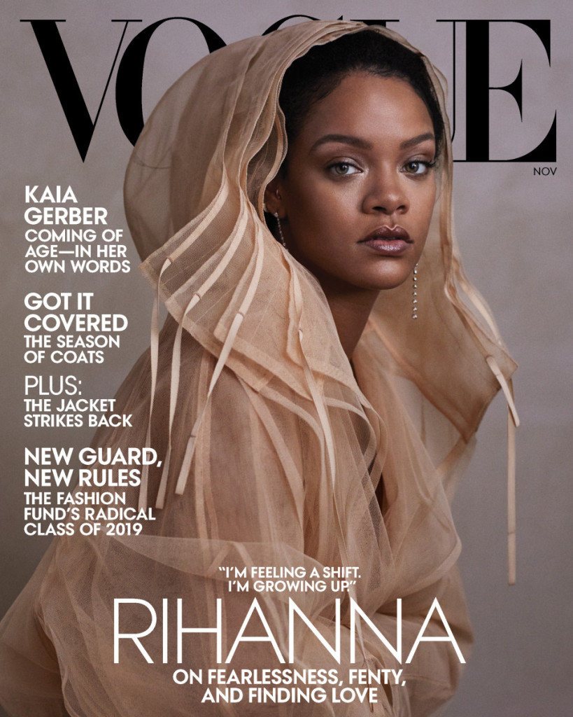
Finally, I like the last photograph due to the colours that have been used I think the beige brown tone is really fitting with Rhianna’s complexion, I also like they way she in angled in the photograph it give the image a new dimension and a new perspective she has a direct approach which draws the readers in. I also like how the title of the magazine is in contrast to the rest of the cover as it is in black and the rest is natural bright colours, the use of the black lettering shows power and sophistication which makes the image really stand out, the lettering is also placed behind the model telling us that Rhianna is the main focus.The white lettering gives the image/cover a refreshed look and brightens the overall cover.
